How to edit text in an image with the same font
When you change a word in a picture, the new word has to look like it was always there. The font is the part most people worry about — but whether you can use the exactsame font depends on two things: knowing which font it is, and having it on hand. When you don't, the goal is a match close enough that nobody notices, and that's usually more achievable than it sounds.
The short answer
- Find out which font it is. Upload a clear crop of the text to a font identifier like WhatTheFont or WhatFontIs.
- If you have that font, use an editor that can load your own fonts — Photoshop, GIMP, or Canva on a paid plan.
- If you don't, match it closely. In PixText, click the text and pick from the closest built-in fonts it suggests, then fine-tune size, weight and colour.
- Handwriting, logos and custom lettering can only be matched approximately, whatever tool you use.
What makes new text look like the original
The typeface matters, but it's only one of several things the eye checks. In rough order of how quickly a mismatch gets noticed:
- Size and position — the new letters should be as tall as the old ones and sit on the same line.
- Weight — regular next to bold is obvious even when the shapes match.
- Colour — copy it from the original letters, not from memory.
- Letter shapes — the font itself: serifs or not, round or narrow, how the a, g and R are drawn.
- Angle and effects — tilt, outline and shadow.
That's why a slightly different font at the right size, weight and colour often passes, while the right font at the wrong size doesn't.
Step 1 — Find out which font it is
Font identifiers compare the letters in your image with large font libraries and list the closest matches. Three that work in a browser:
- WhatTheFont (by MyFonts) — upload an image and it lists matching fonts with previews. There are also iOS and Android apps.
- WhatFontIs — matches against both commercial and free fonts and shows dozens of similar options. Some features need a paid PRO membership.
- Font Squirrel Matcherator — a free identifier from Font Squirrel, powered by Fontspring.
To get better results:
- Crop to one line of text, as large and sharp as you can.
- Straighten it first if the text is tilted or photographed at an angle.
- Include distinctive letters — a, g, R, Q and & tell fonts apart better than o or l.
Screenshots are easier.Interface text usually comes from the device's own system font — San Francisco on iPhone and Mac, Segoe UI on Windows, and often Roboto on Android. For a brand, check its website or brand guidelines; many publish the fonts they use.
If the match turns out to be a commercial font, check its licence before you use it.
Step 2 — If you have the font, use an editor that can load it
Once you know the font and have it installed, any editor that can use your own fonts will give you an exact match:
- Photoshop — besides using installed fonts, Type > Match Font suggests similar fonts for text you select in an image.
- GIMP — free; it uses the fonts installed on your computer.
- Canva — you can upload your own fonts on paid plans such as Canva Pro and Teams.
You still have to remove the old words first — see three ways to change text without Photoshop for how.
PixText can't load your own fonts. If an exact match matters more than speed, one of these editors is the better choice.
Step 3 — If you don't, match it closely in PixText
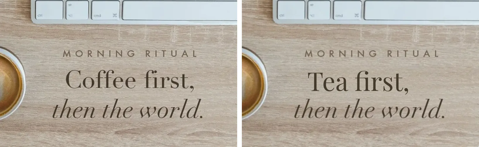
PixTexterases the old words, rebuilds the background, and puts your new text on top as a layer you can restyle. It doesn't identify the exact font; it suggests the closest match from its built-in fonts, and size, weight, colour and position are estimated from the original for you.
- Upload your image (JPG, PNG or WebP, up to 10 MB). PixText finds the text automatically.
- Click the line you want to change and type the new words. On a phone, tap the line and type in the box at the bottom.
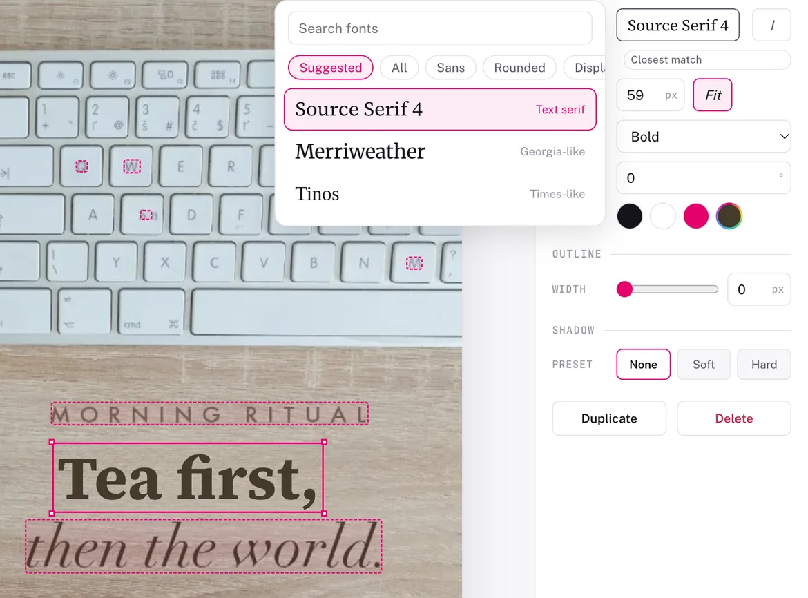
- Open the font list. The Suggested tab shows the closest matches. If none looks right, browse the groups — Sans, Serif, Condensed, Slab, Rounded, Display, Script, Handwriting and Mono, 47 fonts in all. Each name is drawn in its own typeface, so you can compare shapes at a glance.
- Fine-tune in this order: size, weight, colour, then angle. Add an outline or shadow if the original has one.
- Zoom in and compare the new word with the text around it, then download a PNG.
The free plan covers 3 images a day.
When "close" is the best you'll get
Some text can't be matched exactly in any tool, and it's better to know before you start:
- Handwriting and signatures — every hand is different; a handwriting font will only ever be similar.
- Logos and custom brand lettering — often drawn specially and not available as a font at all.
- Very wide or very tight letter spacing— PixText has no letter-spacing control, so spacing that's far from normal will look different.
- Curved or perspective text — PixText can rotate text, but not bend it along a curve or into perspective.
- Non-Latin scripts— PixText's built-in fonts are made for Latin letters; other scripts use your device's own font.
In these cases, changing a whole word or line usually looks better than changing a single letter, because there's no original letter right next to the new one to compare it with.
Use it honestly
Fixing a typo, updating a price on your own flyer or a date on your own poster is exactly what this is for. Changing official documents, receipts, IDs or other people's messages to mislead someone is not — it can be illegal, and it's against our acceptable use policy.